

Bookish is mobile experience that supports students in learning how to learn.
In September of 2019, I returned to school in pursuit of my Master’s degree in HCI. To be quite frank, I wasn’t excited in the least, mostly due to the fact that I was a terrible student. Or so I thought.
As it turns out, I wasn’t a terrible student – I just never learned how to learn. Over the next year, I would try a multitude of learning techniques that ranged from memory exercises to study timers. Some worked, and many didn’t. I found that being able to keep track of these techniques and why they did or didn’t work helped me build a learning repertoire that improved my studying experience greatly.
So when I was given a prompt to create a conceptual experience, I knew exactly what my focus would be. Bookish was born of my personal struggles, and designed to help others build a toolbox of learning techniques that works for them.
Tools
Sketch
UserTesting
Loop11
Roles
Research
Design
User Testing
The Challenges.
Learning is deeply personal.
I knew this from first-hand experience, but education could be a sensitive topic, especially those who had struggled with it in the past. I had to be conscious of what message I wanted Bookish to communicate, as well as the language used.
This was my first UX project. Ever.
Transparency is the best policy, in my opinion. Prior to Bookish, I had never designed an experience or a UI, and the sheer volume of work, research, and thought that went into even a project as short as this was astounding, but highly educational.
The Process.
1. Ideation
Some quick paper sketches helped me begin fleshing out Bookish’s basic structure.
2. Prototyping
In order to conduct initial user tests, I was building prototypes alongside running exploratory tests. These were low-fi models meant to establish the app’s information architecture.
3. User Testing
I began testing with a couple unmoderated quantitative methods – a quick survey to understand what people would want in a learning app, and a task-based usability test to evaluate low-fi prototypes.
I would then conduct an in-depth usability test with a panel of 3 testers on the final prototype.
4. Final Prototype
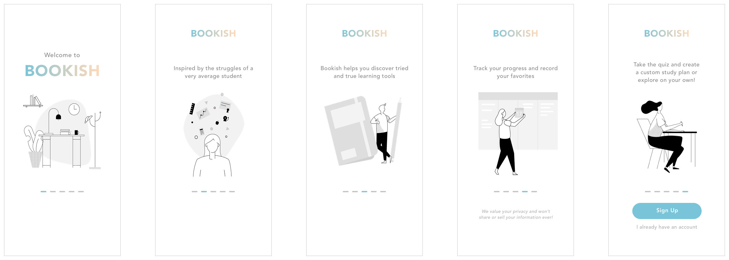
Informed by user tests, the final prototype covered the 4 major user flows: onboarding, taking the learning quiz, accessing the learning calendar, and accessing a learning tool.
Ideation.
If I may, I’d like to start this off with a story. At the beginning of 2020, my bank graciously sent me a productivity planner. Whether they were implying something, or simply being helpful, I decided to use the planner. It was a classy little thing – black, substantial, gold foiling, etc., and I was curious.
Upon opening the planner, I realized that this wasn’t an ordinary planner as it specifically followed the Pomodoro Technique. I had never heard of this technique, but I knew my productivity could absolutely improve, so I tried it out for several weeks before I realized I hated it. The 20-minute timer made me feel like the clock was ever judging me, which caused my studying to suffer, and by the end of the day, I had almost nothing to write under “Tasks Completed Today”. Productivity level: 0.
All this was happening when I was given the prompt to create an application/experience that spoke to me, so I decided to design a mobile app that gave people access to learning and productivity tools that coordinated with their personal learning style.
Prototyping.
Lo-Fi

Onboarding

Learning Style Quiz

Home Screen

Learning Tool
Mid-Fi

User Testing.
Methods
Card Sort - 15 Participants
Quantitative Testing - 22 Participants
Qualitative Testing - 3 Participants
Tasks Evaluated
Onboarding + Account Creation
Could users identify the purpose of Bookish and be convinced to sign up for an account?
Take the Learning Styles Quiz
Did users feel that the learning styles quiz was approachable and friendly?
Access Learning Tools
Could users easily access certain learning tools from the home page? Do they understand the rating system?
Findings

1. Everyone’s needs are different.
Only 46% (6/13) of cards were heavily agreed upon as “important”: To-Do Lists, Note-taking, Schedule Planning, Time-Management, Changing Studying, and Locations.
2. Value communication is weak.
“[You could] possibly explain a bit better what the target audience is for on the app.”
Only 60% of quantitative testers could correctly identify the purpose of Bookish based on the onboarding screens.
All qualitative testers expressed that they did not fully understand the value of Bookish until allowed to explore the app further.
Once the testers’ understanding of Bookish was established, they found the app simple to use.
3. A personalized experience is valuable.
“I liked that everything is in one place, and that the app is about exploring the methods of studying, creating a plan, and finding what works for you. No other app is like this.”
Testers frequently expressed that they enjoyed being able to rate the effectiveness of a learning tool, but that the rating mechanism was not clear enough.
Testers also unanimously enjoyed the friendly and welcoming tone of the app.